

via GameWornAuctions.net
Innocuous : not likely to bother or offend anyone; causing no injury
That’s the Merriam-Webster definition. Many times in life we encounter changes or explanations which can be described this way. Google Maps updates the voice in the guided GPS, breweries change label font, things that ultimately do nothing to the natural flow of life. These are instances that we all ignore at worst, comment on with a heart of neutrality at best.
Fans of the Islanders are used to events less innocuous. Much. Less.
via NHLUniforms.com
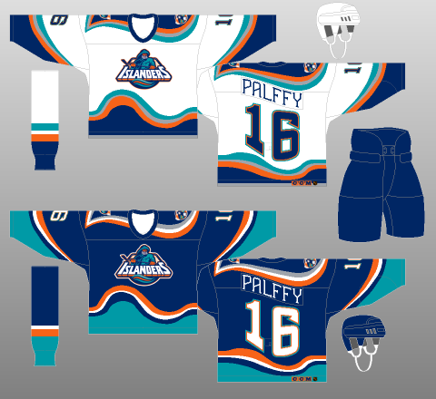
Exhibit A The Fisherman jersey. In 1995 this was a shock to the senses and soul, an abomination so foul it was augmented after one year and scrapped after two. But it was obvious. The new owners at the time wanted to go all-in and give their team a new identity. Fine, happens all the time. What replaced the Gorton’s Fisherman was in many ways comforting and new and fashionable.
Except this.
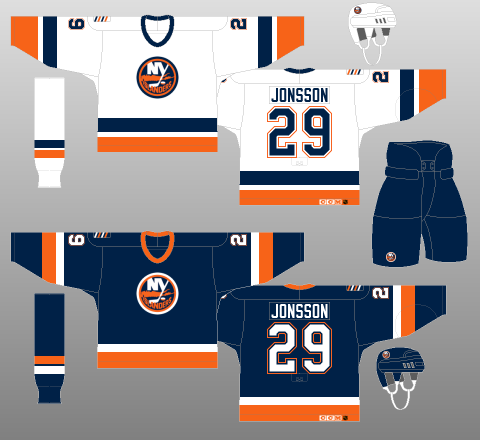
via NHLUniforms.com
What’s that on the right shoulder? There’s no anniversary, number retirement, or death that needed to be commemorated. It’s…a crutch. And it has aggravated me since its unnecessary conception.
The Four Stripes represent the four-straight Stanley Cups from 1980 to 1983, as the Islanders are the last team to accomplish that feat in North American pro sports let alone the NHL. It’s an old mark but a proud one for this franchise. But stop talking about it. The banners remain in the rafters, the rings are still on the fingers of Nystrom and Bossy and Smith, they’re not going anywhere. The four-straight Cups are now the 17lb bass caught up at the ol’ lake. They’re history to be revered not a jersey element to cling to.
The patch would not last long, because the crutch would get bigger.

via NHLUniforms.com
See that? The 2008 third jersey, a near replica of the Dynasty era. OK, looks great. And everything is the sa…

via NHLUniforms.com
They changed the logo to add the crutch.
With their best uniform in 20 years, NOT the Finding Nemo base set, the Islanders literally wove the ghosts into the fabric. The three stripes on the stick became four. It’s a permanent reminder that it’s been 31 years since a Cup was paraded down Hempstead Boulevard. Thanks guys. Needed that.
We stand here today, four stripes where there should be three.
Honoring the past is not a bad thing, relying on it to give relevance to modern mediocrity is an awful thing. The Yankees do not have a pin stripe for each championship (especially on CC Sabathia’s tuchus), nor do the Habs have a barber’s pole ring for their Cups. Even teams with minimal histories don’t add a single piece of flair for their one achievement. (The Tampa Bay Lightning and their “Championship Stripes” underarm gusset were goofy enough to be charming even before their 2004 title.)
Branding the current with the past reinforces that the past is better and the now isn’t getting the job done. Its a superstitious weight this current incarnation does not need to suffer. The fan base, too, knows how long it’s been. Enough, we get it.
Moving to Brooklyn has created a whirling cesspool of uniform and logo hogwash and innuendo. One day they’ll have a third jersey that’s black and looks like the Nets. Whatever, it won’t last long because revenue will always trump marketing gimmicks. As much as the logo should be tweaked to include the entire island past the East River, the three stripes need to reinstated.
It is what the Islanders looked like in 1972, 1983, and 2002. Three stripes is the only way to “honors the past”, allow the ghosts to rest, and walk upright and proud. No crutch.
Three stripes, not four.
