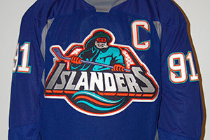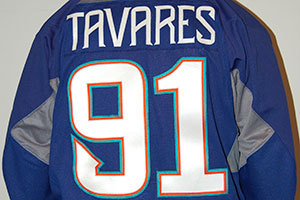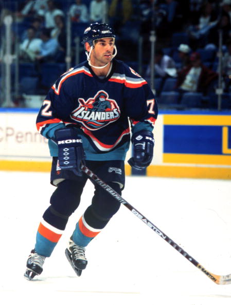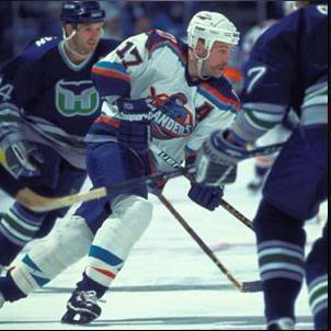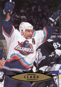
The Fisherman warm-up jersey has been revealed! Hooray!
Uh…what?
These images are from the NHL Auction site and have sparked some discussion among Isles fans.
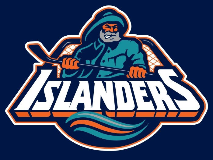
First…this is really, really lame. It’s a modified practice jeresy because it’s just a practice jersey. They’re half-assed. If you’re going full-Fisherman you better have waves, and turquoise, and a lighthouse, and trippy curved nameplates. The Font is right and “C” is right and the logo is right*, but they couldn’t part with the nickels to get the right cloth.
Look at the “ISLANDERS” portion of the crest. It’s going gray/WHITE/gray as if it’s curved and light is shining directly on only a portion of the thread. Take a look at the back, same situation. “TAVARES” is a clear white but the “91” is NONE MORE WHITE, and there’s a curvature to the torso.
Hold on. The logo. There’s something off about the logo. Is it silver, or light blue? Why isn’t it navy blue? I think it’s still navy blue and we’re all falling for an illusion. After a quick consultation with my office’s graphic designer, I forced it out of him that camera flash COULD be the culprit here. Thanks, Eric.
The navy blue is exactly the same throughout the original logo but in game photos the navy blue stick sometimes did appear lighter.
As an aside, I hope this is a human wearing the jersey if not it’s the single crappiest mannequin ever.
Anyway, for as cool as this special night is going to be it’s slightly deflated by a lack of thoroughness. And shiny thread.
