
A “missing’ shoulder patch. Jersey weirdness (which is saying something for this era of the Islanders). Deja vu. Vuja de. Mandella Effect. Or, you may be right, I may be crazy. A possible photoshoot at Jones beach. And the Buffalo Sabres may be involved. Its weird.
On the most recent episode of Lighthouse Hockey’s excellent Weird Islanders podcast (which you should be subscribed to), Dan Saraceni mentioned that his first recollection of the Islanders’ navy blue, classic-ish uniform came from a photoshoot at Jones Beach with then-Islander Sergei Nemchinov (the discussion starts at 13:15 of the episode). While I don’t share this memory, it’s completely plausible that it happened. The Isles have used Jones Beach as a backdrop for countless promotional material, gameday giveaways, meet-and-greets, and in-game hype videos. What my memory conjures up is an unofficial and sneaky unveiling during the end of the 1997-98 season, disguised as the ceremony naming Trevor Linden the 7th captain in team history. And then more things revealed themselves.
Uniform and logo reveals in the 1990s didn’t have the HYPE factor that usually accompanies today’s marketing nonsense. If a team was planning on making a uniform, logo, or other aesthetic modification, it started and ended with a blurb in the paper or team program. And then they wore it. The End. Sometimes, it was a completely out of the blue. In 1996, the Buffalo Sabres went all out and debuted the next season’s uniform and logo overhaul before one of the last homes games of the year.
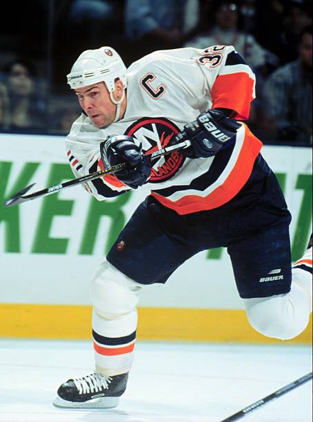
On March 3, 1998, the Islanders decided to give a sneak peek at the next edition of the uniform when Denis Potvin gave Trevor Linden his home white captain’s sweater prior to a 3-1 victory over the Philadelphia Flyers. It was only Linden’s third game as a New York Islander and he was receiving the highest honor. Everything looked fairly normal except for the fact that it wasn’t the hybrid Wave/Original Logo the Isles would stop wearing after the 1997-98 season. Maybe this was a nod to prior Islanders captains in attendance, specifically Potvin and Gillies.

The 4-stripe shoulder patch, that we would come to know as a key feature to the 1998-2004 uniform, was not present. Possibly still in development? Couldn’t be manufactured in time? They had the correct socks for the next season. That can’t be happenstance. Those are details we may never know. This answers the question I had, when did we first see the non-wave Islanders uniform. But a new wrinkle emerges.
Was Trevor Linden wearing yet another hybrid jersey? Yes. They all were.
The first and most glaring connection between the Old and New was the captaincy patch on Linden’s jersey. It’s the C off the Fisherman/Wave jersey, less the teal. There’s also no additional navy outline to the numbers or captaincies, just blue trimmed with orange. The font treatment (blue with orange trim) is nearly identical to the number font style since the team’s inception.


The alternate captain A on Scott Lachance’s jersey, evocative of the pre-Fisherman playoff years, served as a foreshadowing of what would be on Adrian Aucoin’s jersey.
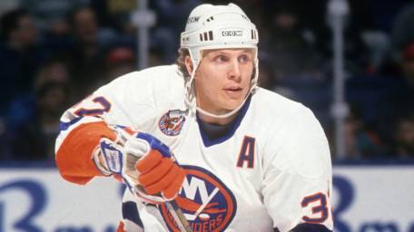


Take a close look at the 2’s on Linden and Kenny Jonsson’s jerseys. It’s the same 2 from the Fisherman. Upon multiple viewings of the 1997-98 highlight video posted by IslandersPride, the 2 is the only number to migrate to this One Night Only uniform. The IslandersPride video jumps directly to the April 9, 1998 loss in Boston, with the men of Nassau County in the road blue Wavy Gravy uniforms. It’s unclear how many games the Islanders wore this retrofuture hybrid fauxfuture uniform.

Compare all of this to the fully formed and debuted navy-based uniform below. Pretty close to the real deal. But for one night (possibly), the captain wore the hooked-C and everyone with a 2 had the retiring format.

To recap:
- Classic-esque white uniform with navy blue replacing royal blue
- 1998-2004 era striping on jersey and socks
- 1995-98 era captaincy patch and numeral 2
- 1972-1995 font for the rest of the jersey
- Worn possibly once for Linden’s first game as captain
This was not a normal era for any professional sports team, let alone the New York Islanders. Just ask Nick Hirshon about the lead up to, and the years of, the Fisherman. Why carryover some pieces of the outgoing jersey when it was obviously possible to create 90% of a new font set on the fly? And why weren’t Potvin and Gillies given C’s for this ceremony when that’s become SOP over the last few years (save for inconsistencies with Gillies)
The next question needs to be, how did this happen?
(Thanks to Dan Saraceni (@cultureoflosing) for his contributions to this quick research project.)
UPDATE: Upon further review, the number font is straight off the pre-Fisherman set, only the Capitancy is from the Fisherman uniform. Less of a mashup, more questions as to why combine two elements from two vastly different sets.

Pingback: Islanders Anxiety – Episode 194 – Rooting for the Same Miracle